Juxtism
Book design representing a personally crafted "ism" that reflects my conceptual and visual identity.
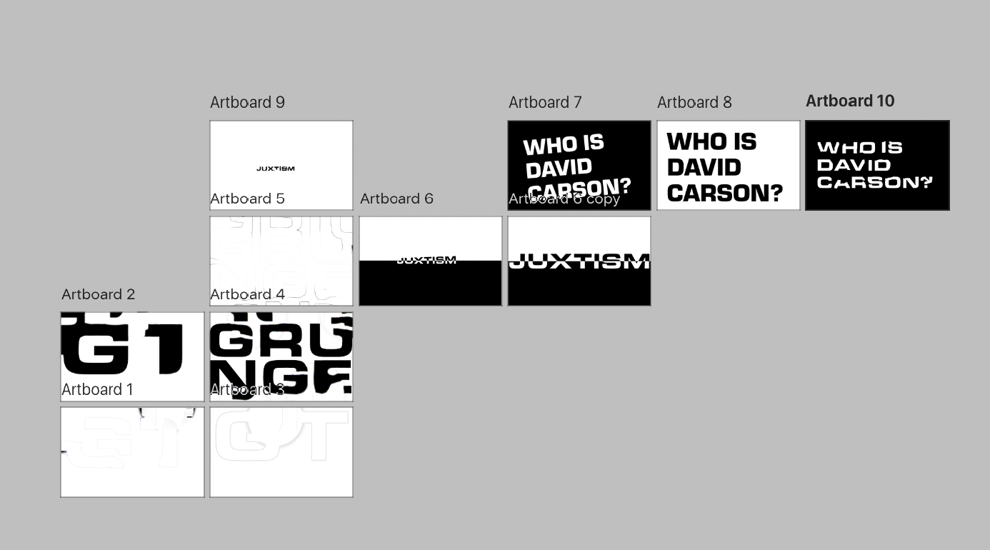
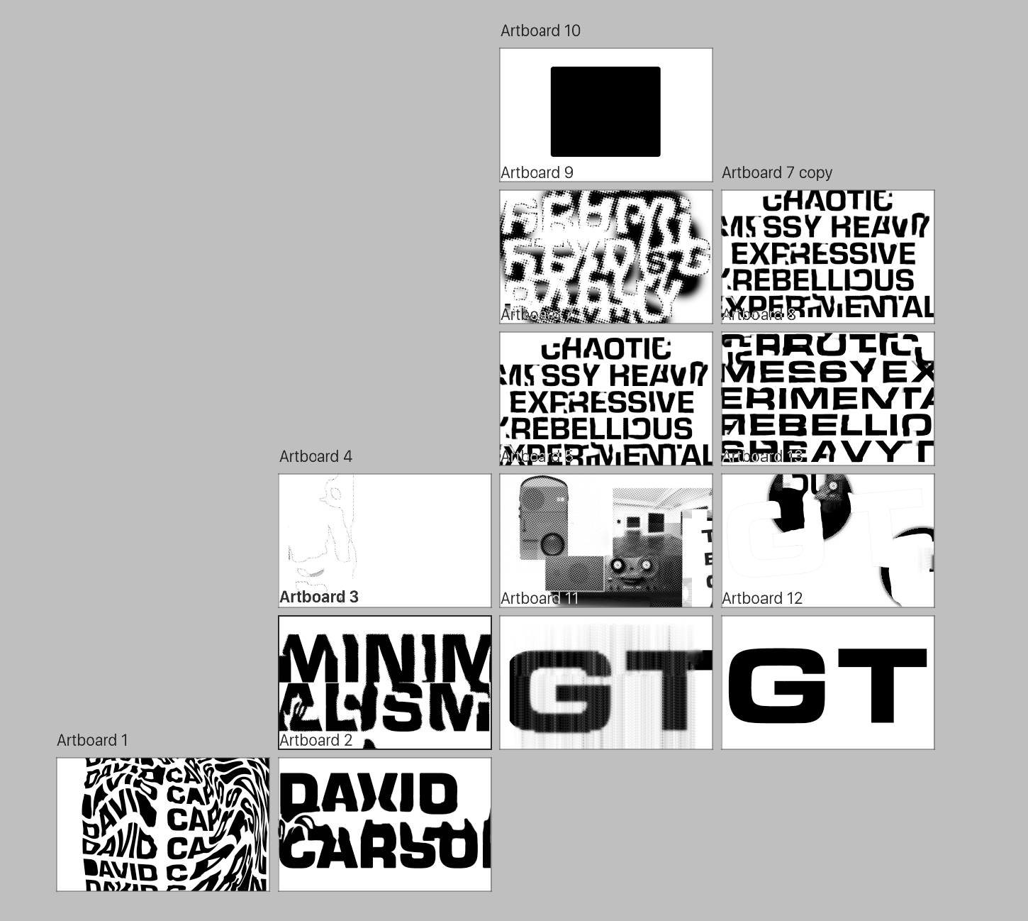
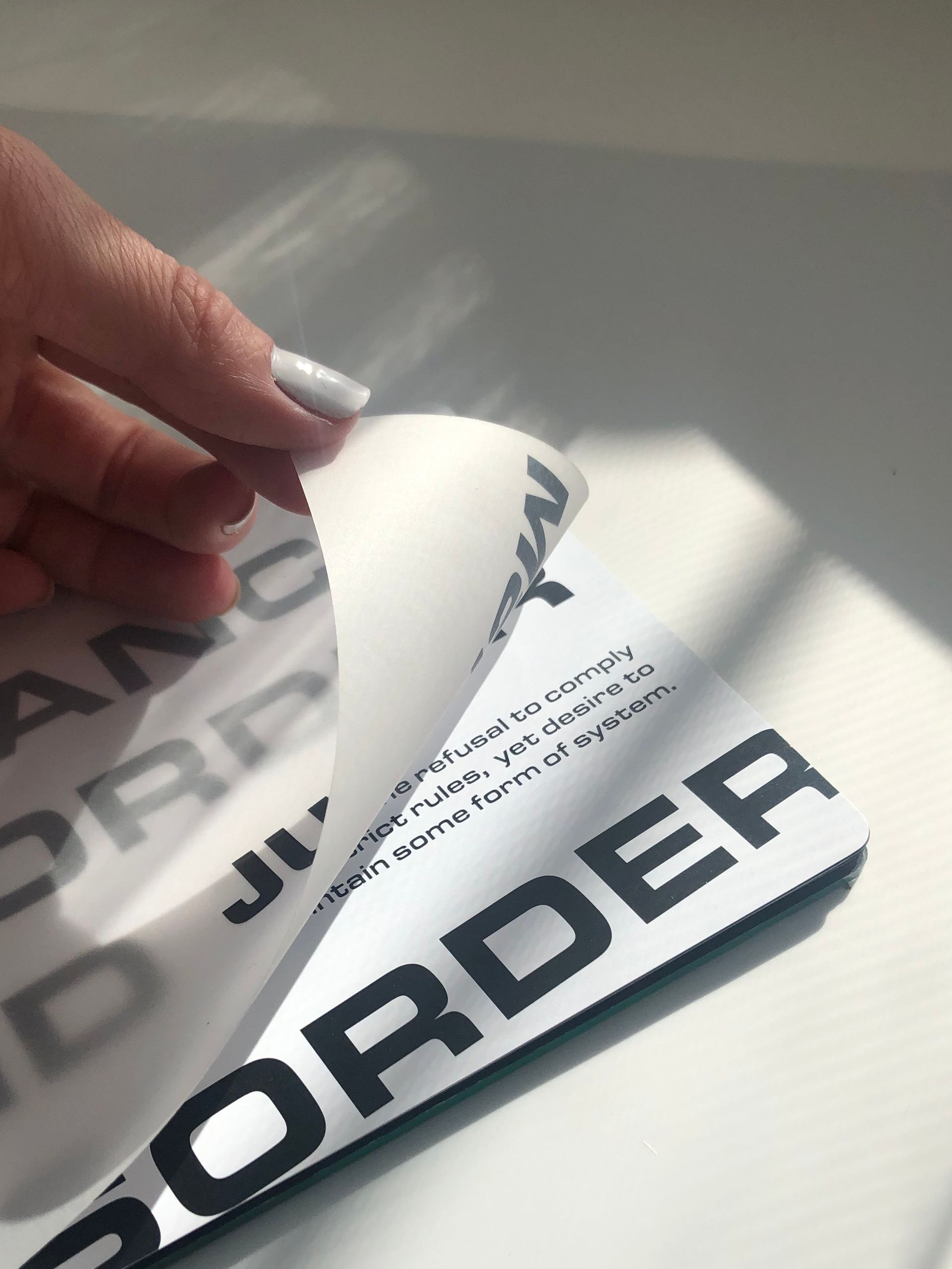
This project involved creating an "ISM" that visually and conceptually represented me. I drew inspiration from two art movements I admire: Minimalism and Grunge Typography. My goal was to blend the simplicity of Minimalism with the experimental nature of Grunge Typography to form a unique visual identity called "Juxtism."
Contribution
Book Design
Photo Manipulation
Graphic Design
Copywriter
Tools
Photoshop
InDesign
Illustrator
Print Media
Year
2020
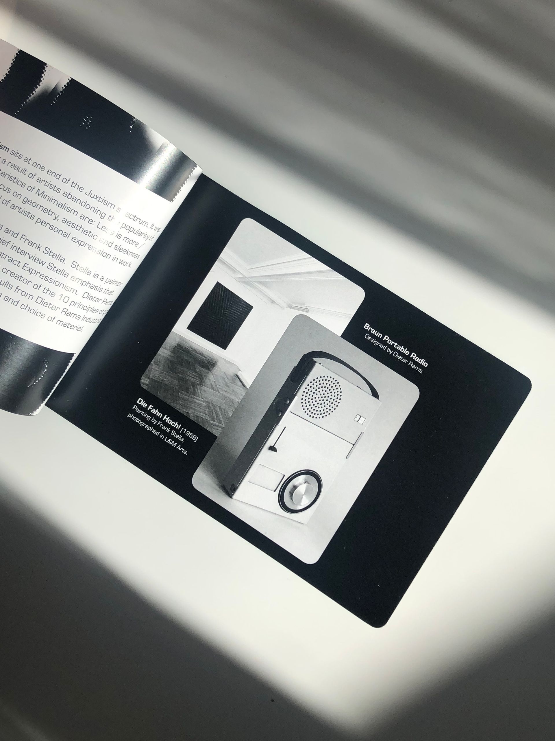
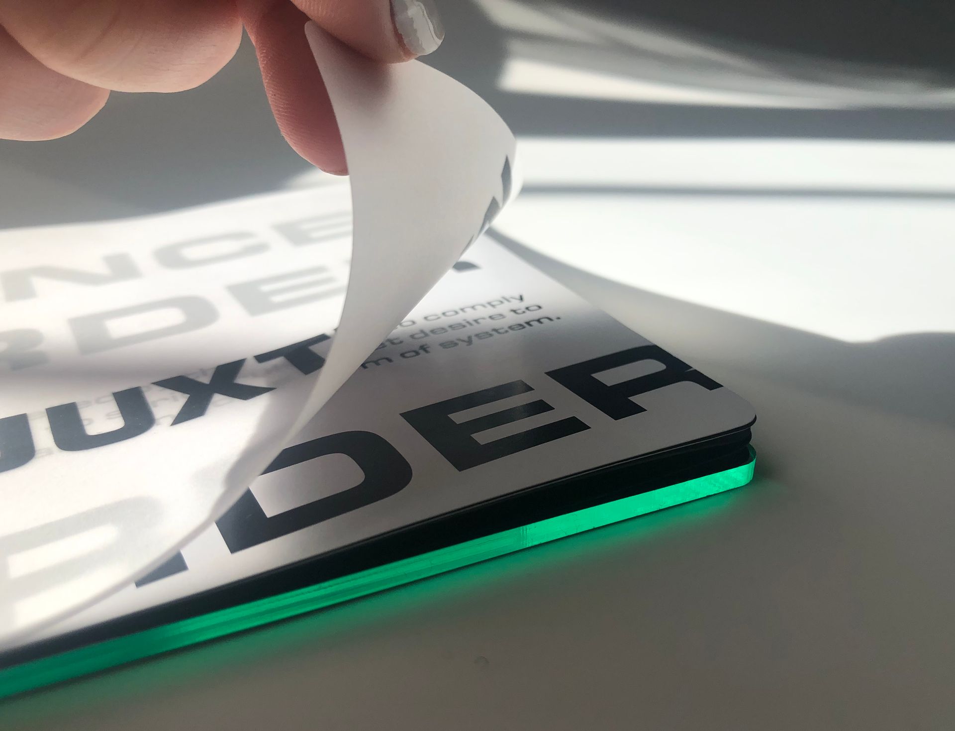
Juxtism leans more towards Minimalism but remains flexible, reflecting the ever-changing nature of Grunge Typography. This flexibility is symbolized through a spectrum, which influenced the project’s color palette—featuring stark contrasts between black, white, and blurred greys—and was also embodied in the foggy acetate book cover.
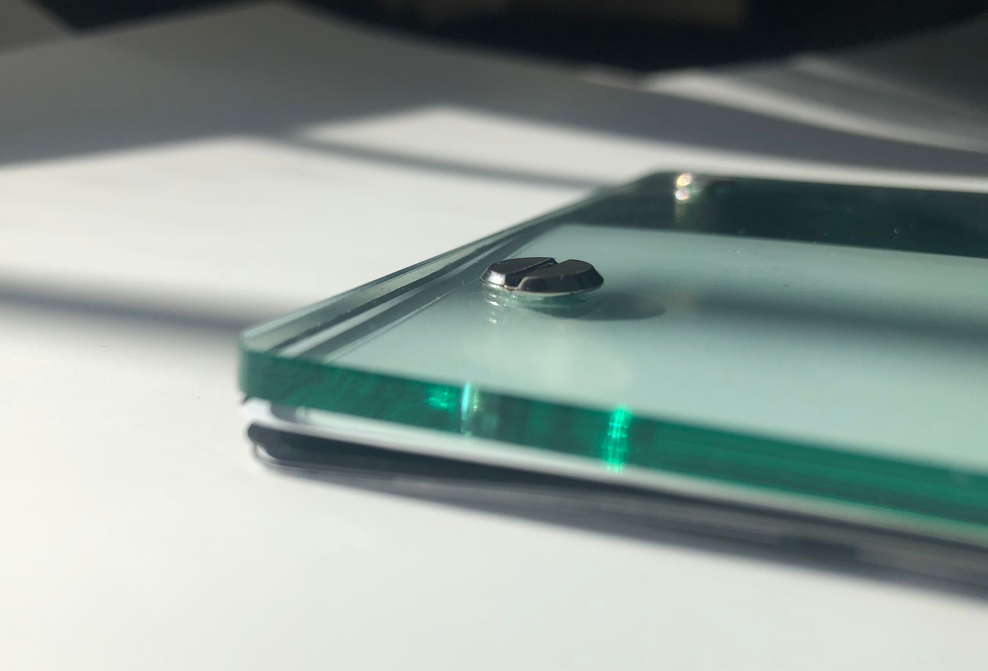
Material choices played a key role in expressing the idea of juxtaposition. I combined hard materials like metal, plastic, and thick paper with softer elements like acetate and interior paper. For the book's construction, I used glass-colored acrylic and Chicago screws, drawing inspiration from Dieter Rams’ designs for Braun, known for their use of plastic and metal.