Jordynn

Portfolio/24

My goal is to create approachable and functional designs, without overlooking visual identity.

About me

I'm Jordynn, a designer based in Montreal. My primary focus is on crafting visually appealing interfaces and digital experiences for projects related to small businesses, marketing solutions, and e-commerce.


However, my background is multifaceted. My diverse studies have equipped me with experience and expertise across various domains that inspire both my work and daily life. Furthermore, they've afforded me the opportunity to gain hands-on experience in a wide array of design and art fields. These encompass white label design, curation, conceptual design, responsive web design, product design, book design, illustrations, and more, all contributing to a comprehensive skill set for creative communication and problem-solving.


I would describe my approach as Gesamtkunstwerk, where a multitude of disciplines and art forms converge to construct a "cohesive whole."
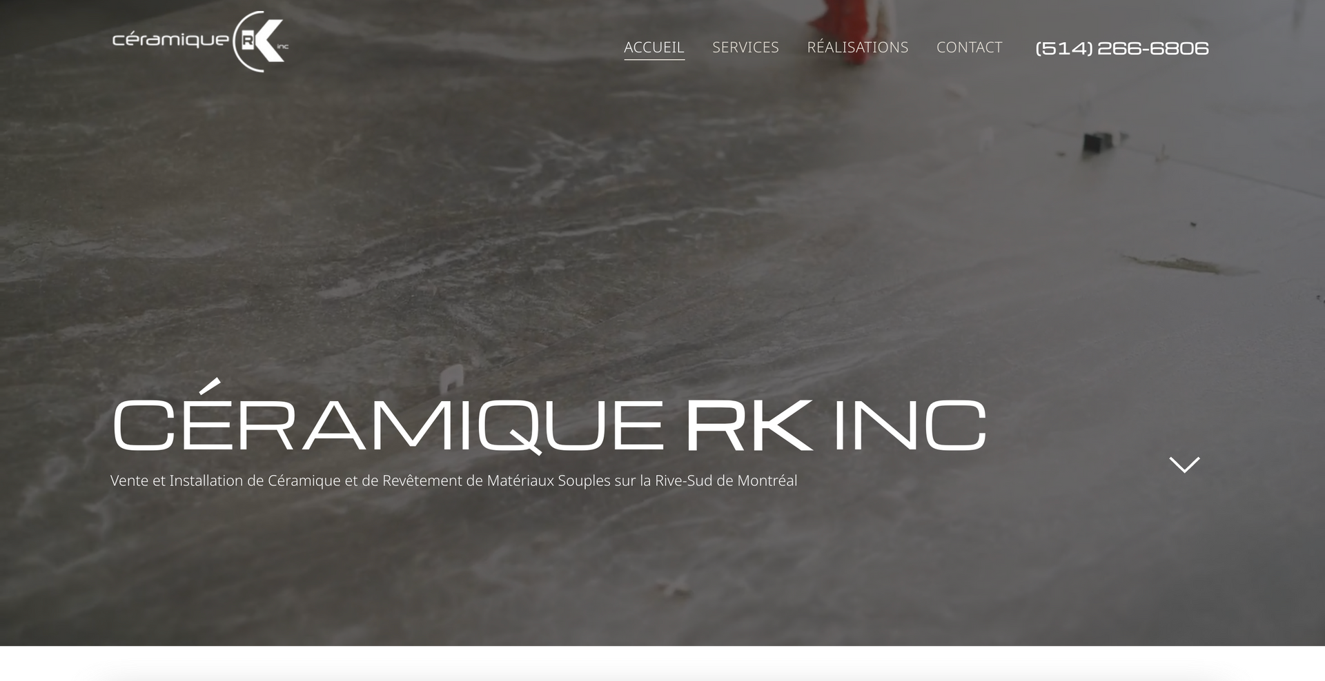
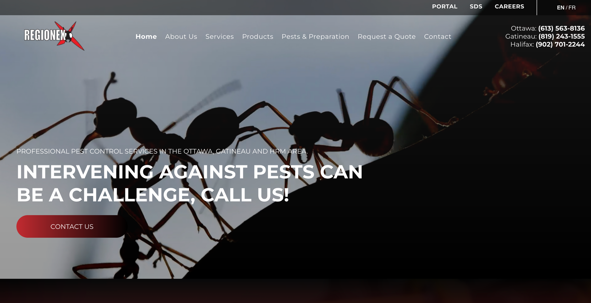
Selected Websites

2022 | Web Design

Dilypse

2023 | Web Design

Clear Out Co

2023 | Web Design

Reinhardt & Fils

2023 | Web Design

Céramique RK

2023 | Web Design

Solution Soudure

2023 | Web Design + E-commerce

Distribution Composites

2022 | Web Design

Regionex

Other Work

2021 | Personal Ethos Project

Exist/co

  • "The things we consume do not only exist while we are coexisting."

    Exist/co is a research-creation project that arose from developing a personal ethos statement.


    I believe space and how one chooses to fill said space can act as a tangible display of one’s identity. My identity places value on the complexity of space itself and all that inhabits it. While simultaneously acknowledging that the fulfilment gained through filling space, results in wicked problems concerning overconsumption, sustainability, thing-power and ethics.


    The act of filling, consuming or rearranging the broader space that is the pluriverse is nearly unavoidable. Therefore, I push for more conscious consumption practices in terms of the past, present and future of things and strive for more ethical consumption under capitalism by promoting the ideology that: the things we consume do not only exist while we are coexisting.


    All the components of my research-creation project exist on a four page website. Including the landing page, the 3d installation/animation, a page that explains the project and a virtual fitting room where the garment can be tried on with your phone camera. I opted for an independent website over an app, due to wanting to limit the project’s dependence on larger corporations.


    The digital installation will be a 3d model that the visitor can explore. It is animated to display ice melting causing the plants to grow while the vest remains unchanged.

2021 | Book Design

JUXTISM

  • "The balance between order and disorder."

    The project brief pushed the idea of creating an ISM that represented us visually and conceptually. For this reason, I chose to look at two art trends/movements which I pull inspiration from and enjoy visually, these movements being Minimalism and Grunge Typography. The next stage was to develop a visual identity for my ISM.


    I wanted to combine qualities of both minimalism and grunge typography in such a way that allowed for visual simplicity (minimalism) yet the opportunity to experiment (grunge typography).


    My approach to Juxtism sat closer to minimalism. However, grunge typography is consistently changing and for this reason, I allowed Juxtism to be defined on a spectrum, which would leave room for such changes and experimentation.  


    The idea of a spectrum influenced the colour palette of Juxtism, with harsh contrast between black and whites, paired with images made up of blurred greys. This blurring was further reflected in the cover, made from a foggy acetate.


    Material choices further pushed the narrative of juxtaposition, as the hard-tactile qualities of metal, plastic and a thick paper fold-out were paired with softer acetate and interior paper.


    I used a piece of glass-coloured acrylic and Chicago screws for the construction of my book. This linked the materiality aspects of minimalism; more specifically the work of Dieter Rams, as many of his designs for Braun are plastic or metal. 


    I kept a cohesive rounded theme throughout my book, from the corners to the typography choice to other visual aspects including the lines in the grid and backgrounds.


    A key aspect of grunge typography is the typography itself and the experimental use of bold letters. I adopted this concept into Juxtism through the distortion of the large bold type which created the backgrounds. 

View PDF

2019 | Book Design + Internship

Triple Check / Rad Hourani

  • Triple Check acts as a recap of my experience at Rad Hourani ...

    Triple Check acts as a recap of my experience at Rad Hourani during the Summer and Fall of 2019 as part of an internship through Concordia University. I have chosen to title it “Triple Check” as checking three times was emphasized regularly throughout my internship, whether it was verbally or written on signs within the work environment. 


    This book contains documentation of the diverse roles I took on during my internship, as well as summaries and assessments of key experiences - including but not limited photography, book design and exhibition work.

View PDF